MERSIVE LANGUAGE LEARNING APP
AUGMENTED REALITY PROTOTYPE

THE PROBLEM SPACE
Immersing yourself in an environment where a target language is spoken is the best and fastest way to learn. But for many language learners, from the busy parent to the hardworking professional, this isn’t always possible.
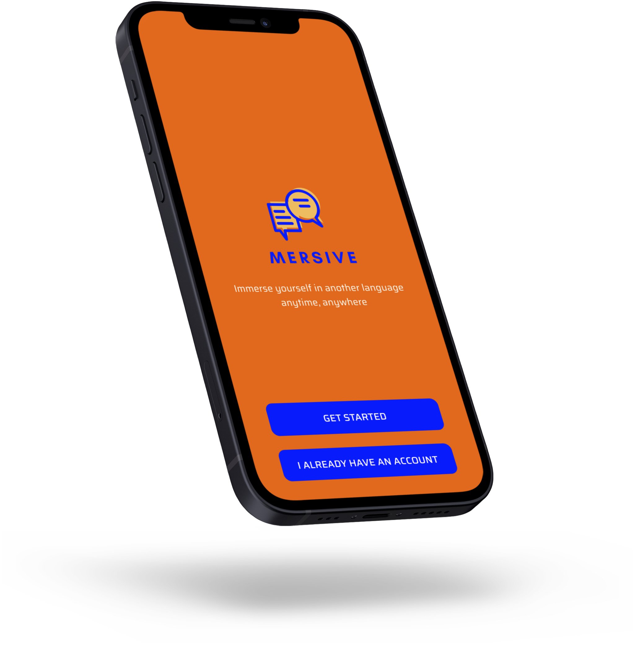
The Mersive app makes language immersion accessible.
With the use of augmented reality technology, this app interacts with the user’s physical environment to simulate immersive learning. A fun, engaging, and customizable digital avatar supports the user through each lesson acting as a language guide.
MY ROLE: UX Designer (Student Project, BrainStation)
User Research, User Interface Design, Interaction Design, Visual Design, Information Architecture, Prototyping
DESIGN TOOLS: Figma, Canva
TIMEFRAME: 5 weeks (completed December 2022)
BACKGROUND: This prototype was completed as part of BrainStation’s UX Design course. I created a clickable prototype but please note that the augmented reality and avatar features are conceptual and not functional.
USER INSIGHTS
I interviewed several language learners at various stages of their learning journey. Here are some of the core user insights:
Limited Time and Money: Users value opportunities for immersive language learning but often don’t have either the time or money to regularly access such environments (ex. travel, language programs, relocation)
Low-pressure Learning Environment: Users want low-pressure, judgment-free environments to practice a language
Make it Social: Users want language learning to feel like a social experience
More Fun, Less Frustration: Users describe language learning as frustrating and want the
process to feel more fun and engaging
The insights gleaned from my interviews guided my design decisions and informed the creation of the following two user personas:
USER PERSONAS
INFORMATION ARCHITECTURE
I created a detailed sitemap in order to visualize each screen of the app.
USER FLOW
I created this user flow based on the persona of Mariam Salah, a busy professional who wishes to improve her beginner level French for her employer.
The clickable prototype reflects this user flow which outlines the initial steps of the user’s first language lesson.


SKETCHES & WIREFRAMES
Throughout the process, I took a methodical approach to designing the user interface, starting with initial sketches and moving on to wireframes.
I outlined all aspects of the UI such as layout, colour scheme, and typography and settled on a design that is both playful and modern.

STYLE GUIDE
Learning a language digitally can be a daunting undertaking. As a UX designer, I recognize that selecting the right colours and font styles can make the process easier, more pleasant, and help users achieve their goals. I conducted research on colour psychology and chose colours with positive associations.
Orange, the main colour, conveys a sense of optimism, confidence, and bravery
Yellow invites happiness and is associated with creativity
Blue is often associated with stability, harmony, peace and calm.
I also selected an accessible sans-serif font that has a moderately higher readability than serif fonts. Finally, I designed a logo using Canva.

LEARNING OUTCOMES
From ideation to prototyping, this was an exciting first foray into the world of user experience design.
Value of a User-First Approach: Drawing from my own language learning journey, I initially made some assumptions about how best to approach designing this app. I soon realized the importance of maintaining a user-centric mindset which enabled me to think beyond my individual needs and preferences.
UI Design Humbled Me: I recognize that the UI for this project is not fully aligned with industry-standard design work and would require significant improvements. I’m continuing to deepen my understanding of fundamental design principles to improve my overall UXD approach.
Possible Tech Limitations: If I were to build this out, I’ll need to thoroughly assess whether this app is technically feasible (AR and AI technology, specifically). It would be crucial to include developers and engineers early on in the process to identify any possible limitations.
This Idea Lingers Within: Although this was a student project, I’ve planted a seed. I want to create this app and wish to one day assemble a team of language-learning experts, AR developers, AI experts for object identification and to create customizable, interactive avatars (I used a Bitmoji as a placeholder but it’s not interactive and cannot be used commercially, anyway).
ANOTHER PROJECT


